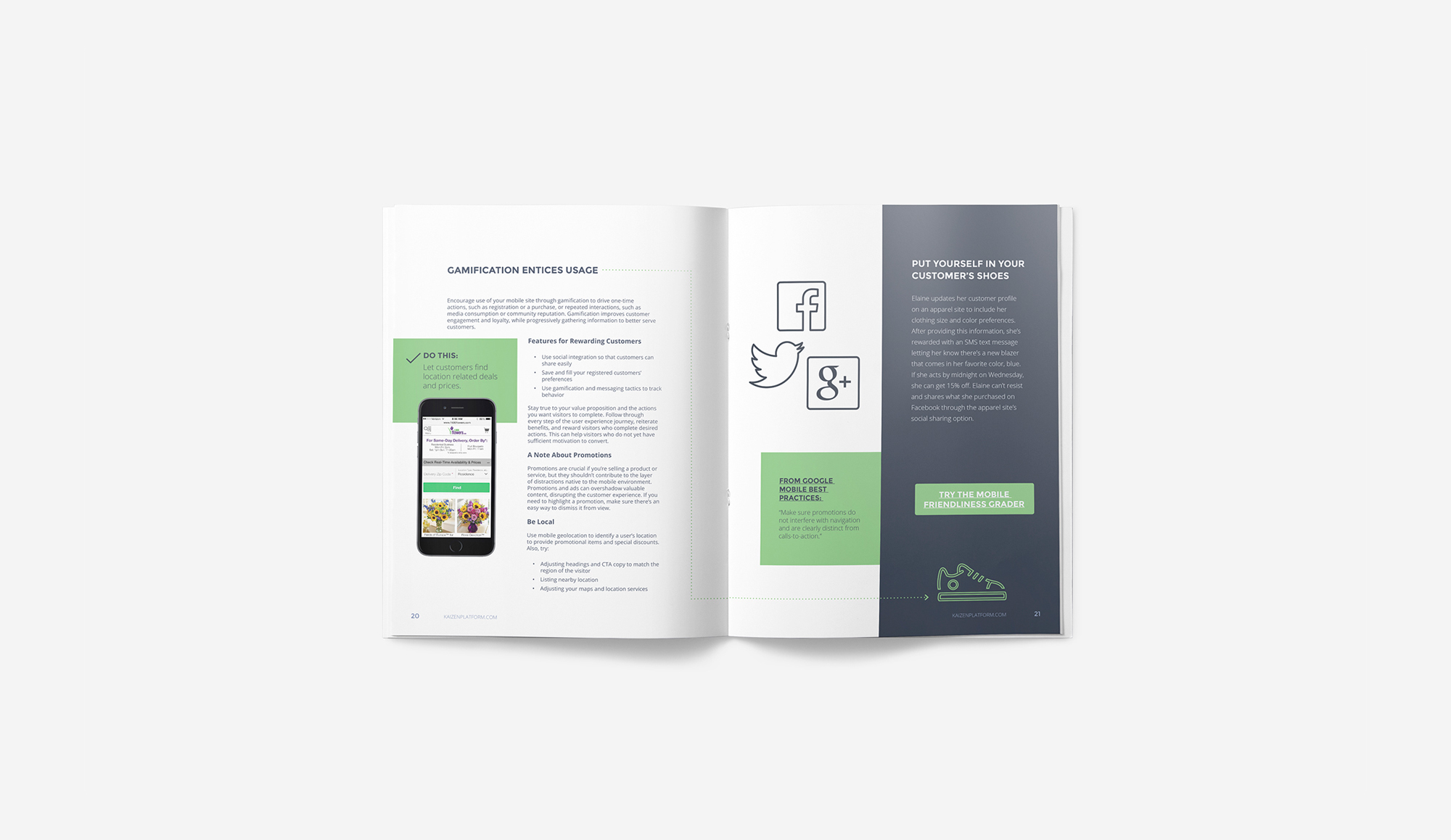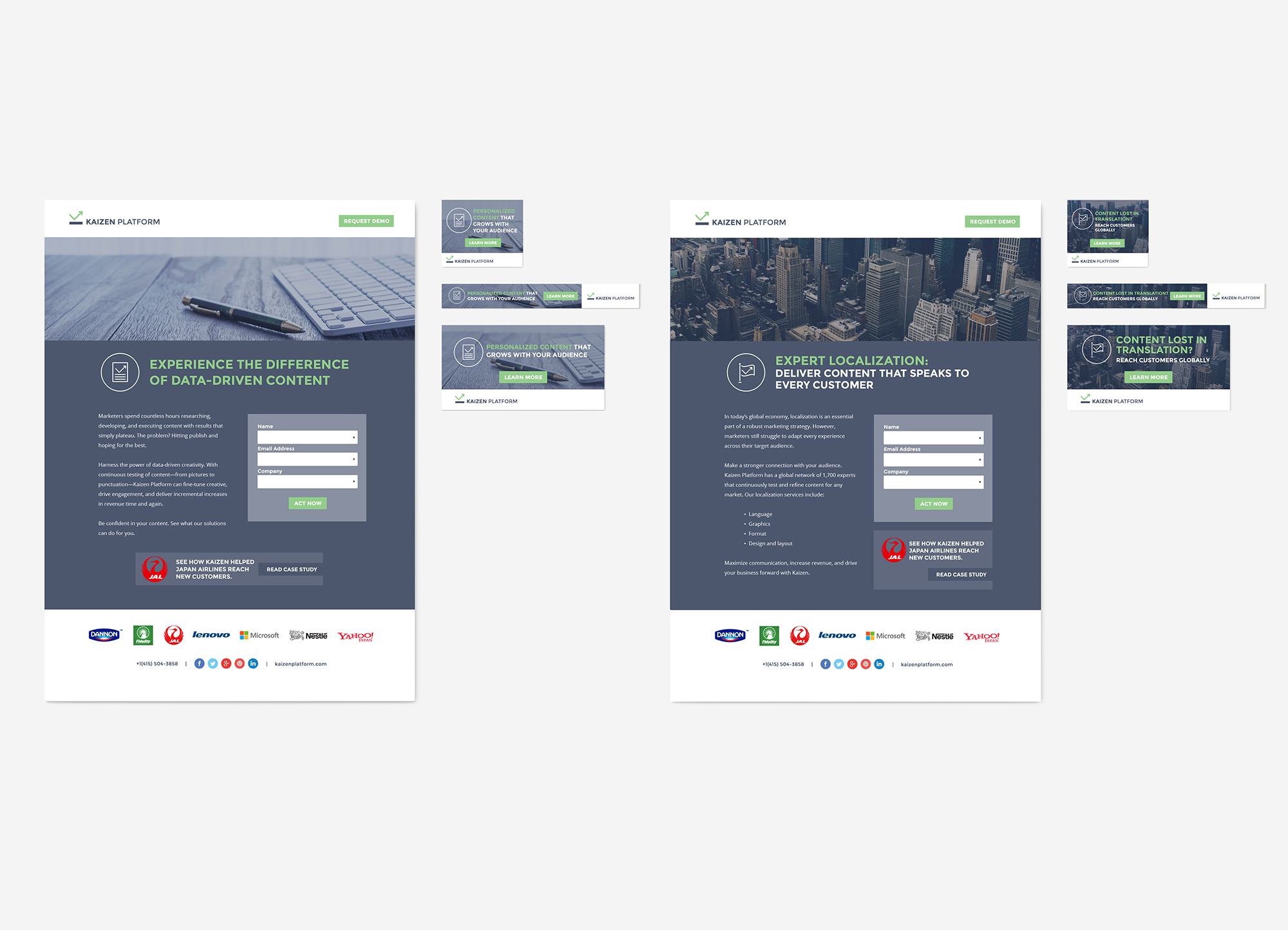
Kaizen Platform Marketing Materials
Japanese headquartered Kaizen Platform reached out to Pop Design Group to help create a new brand look for it’s US based operation. Working within the existing brand guidelines, we were able to bridge cultures by creating a unified look for the company. We were influential in changing the logo color from red to green, communicating a positive connotation in the American culture. Pop Design Group also assisted the company in branding by supplying an extensive image bank for them to use in ads/marketing which all had a unique style and photo color effect applied, continuing the brand scheme. We slo provided may custom designed icons/illustrations for marketing use as well. We also produced several eBook’s and Whitepapers that were distributed digitally including custom illustrations, and live hyperlinks; online ad bets with corresponding website landing pages; sales decks and case studies using Google Sheets & Powerpoint; kiosks & tradeshow booths; and thank you cards.